Visualizing Resilience: A Unified Identity for a Global Community
Executive Summary
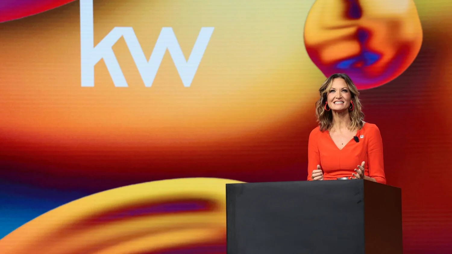
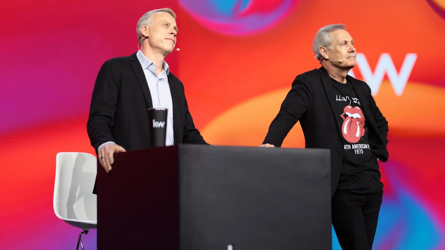
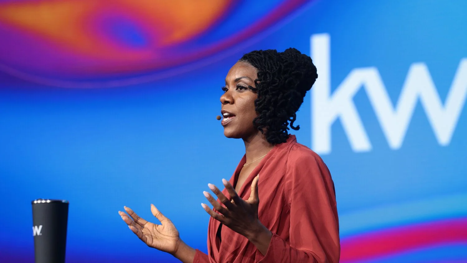
As the lead designer for Keller Williams’ premier annual conference, Mega Camp, Joe Rodriguez was tasked with creating a visual identity that could anchor a high-stakes educational event for tens of thousands of professionals. He developed a conceptual framework of "Liquid Resilience," moving the brand from a static identity into a dynamic, cross-platform system. Over six months, Joe steered this vision through a massive collaborative effort, ensuring brand integrity across video, animation, environmental design, and digital communications.
The Details
The Conceptual Foundation: Liquid Metal
1
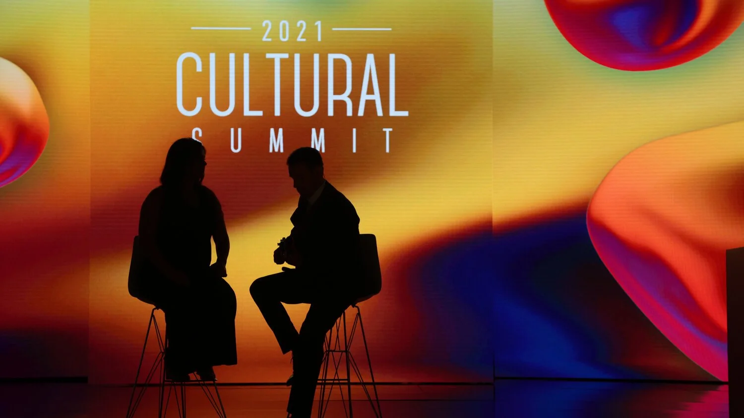
The 2021 event took place during a transformative period for the real estate industry. Joe sought to develop a design that reflected both the strength and the adaptability of the community.
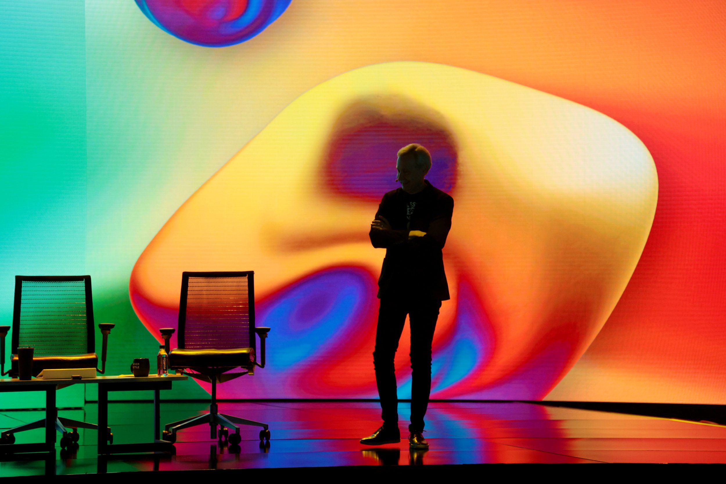
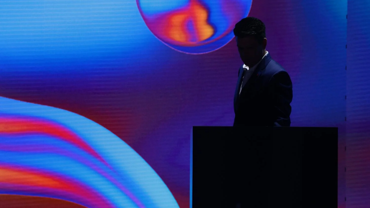
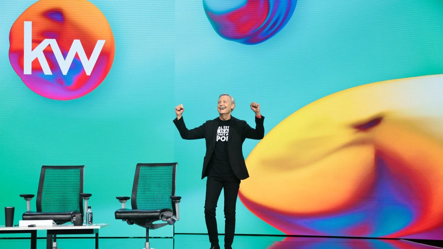
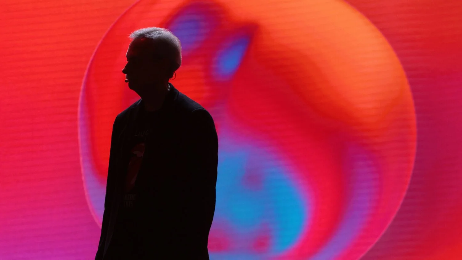
The Metaphor: The core visual featured a liquid metal shape flowing through space. This represented a community that was both fluid enough to navigate difficulty and solid enough to remain durable.
The Aesthetic: By moving away from traditional corporate graphics toward high-fidelity, 3D-inspired textures, Joe ensured the brand felt premium and modern—essential for a flagship event featuring industry leaders and top-tier training.
Creative Stewardship & Cross-Functional Integration
2
Once the "Liquid Metal" concept was finalized, Joe’s role transitioned into that of a Strategic Creative Lead. For six months, he acted as the bridge between the initial design and its various executions across the organization:
Motion & Narrative: He collaborated with the animation team to define the "physics" of the liquid metal, ensuring its movement felt intentional and mirrored the energy of the keynote address.
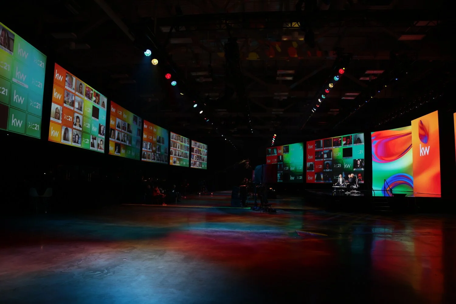
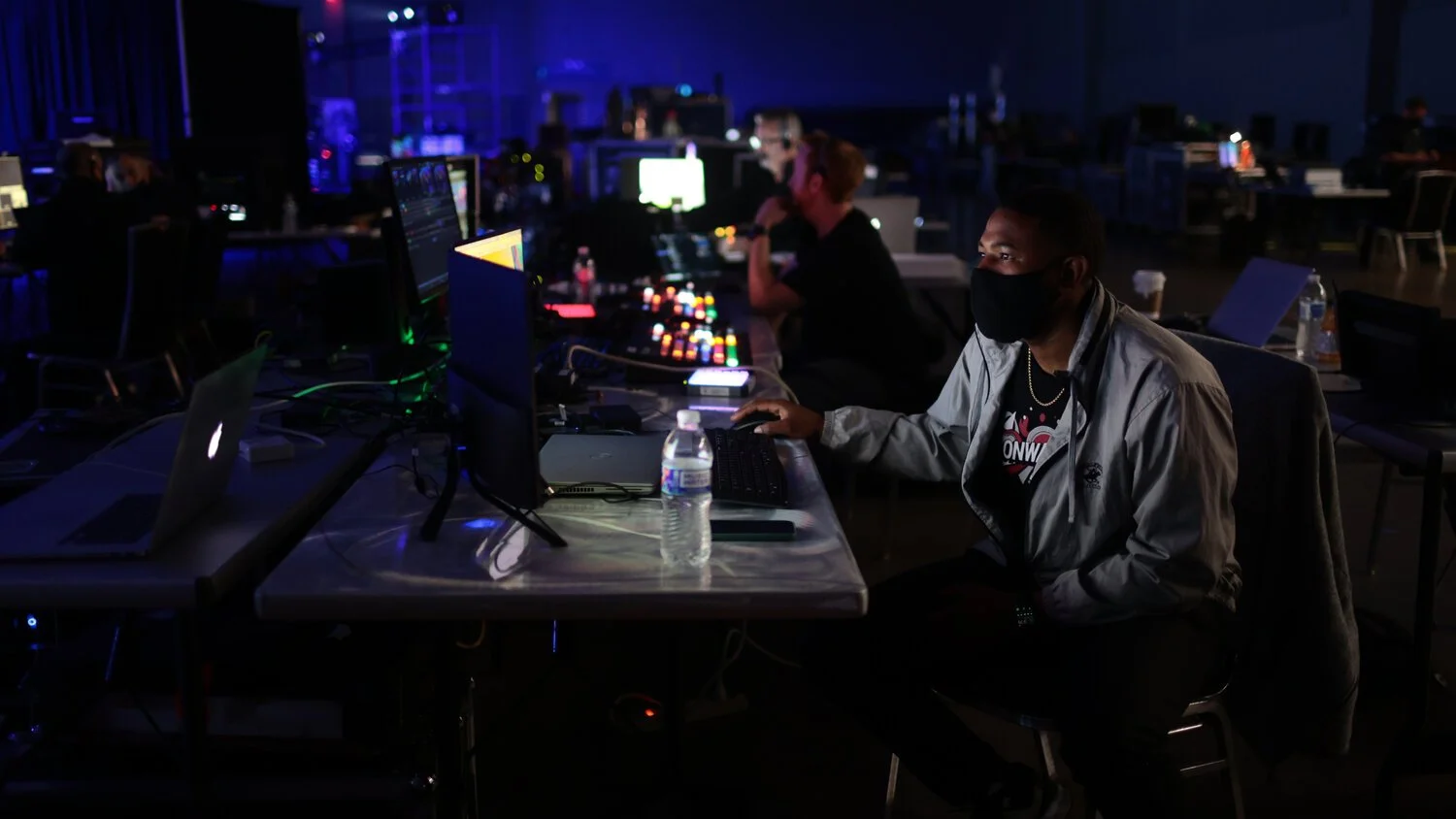
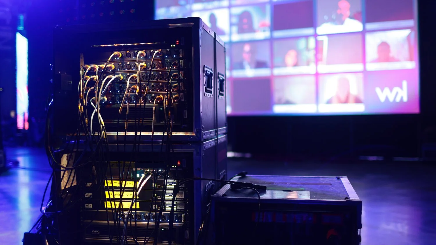
Technical Execution: He worked closely with video and logistics teams to ensure the complex textures and lighting of the brand were rendered perfectly across high-resolution stage LEDs and digital streaming platforms.
The Strategic Pivot
3
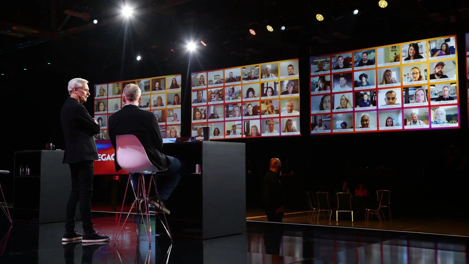
While the visual system was designed to be immersive in a conference environment, its strength was tested when the event moved to a digital-only format late in the production cycle. Because Joe built the brand on a foundation of movement and digital-first fluidity, it transitioned seamlessly to a broadcast environment, maintaining a high-production-value feel for remote attendees without losing its impact.
The Impact
4
Unified Vision: Successfully maintained a cohesive brand identity across several production departments over a half-year timeline.
High-Fidelity Engagement: The dynamic visual system provided a premium "broadcast" feel that supported keynotes from top industry leaders.
Systemic Scalability: Joe created a comprehensive asset library that allowed social, web, and email teams to deploy the brand rapidly across all marketing funnels.
Design is at its best when it serves as a unifying force. For Mega Camp 2021, Joe’s goal was to create a visual language that felt as strong as the community it represented—resilient, adaptable, and forward-moving.